Helping influencers increase user engagement on their websites
Allowing users to add multiple pages to their website
Company
Skills
Information Architecture, Wireframes, Prototyping
Tools
Figma
Timeline
Nov 2020 - Mar 2021 (part-time)
Team
3 designers, 2 product managers, 2 developers
About Beacons
What user need does it address?
Beacons sites are a one-stop shop for fans to support their favorite content creators. Fans can find a content creator’s social media links, merchandise, and more in one place instead of searching for them.
What is it?
Beacons is a website-builder for influencers (social media personalities) to post their affiliate products, social media links, and more.
How is it different from other website builders (like Squarespace, Wix, etc.)?
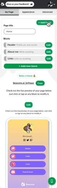
Beacons sites are single-page websites that influencers can easily build by stacking blocks. Examples of blocks are the header, link blocks, and store blocks.

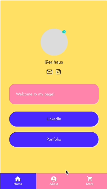
A Beacons website

Stock image of the imagined average user
The Typical Beacons User
Content Creator, Age 25
Goal: To pursue content creation full-time
Background
Busy with managing brands and collaborations, creating content, and interacting with their audience
Doesn’t have time to learn web design or development skills
Needs
Simple UX they can learn fast
High customization and personal branding potential
Need to see value immediately
Frustrations with Beacons
Their page gets too long and cluttered
Difficult to navigate page
Page is overwhelming to look at
People Problem
Creators need a way to organize their content so visitors to their site can find what they’re looking for and engage with their content.
Examples of how visitors can engage with website content
Buying affiliate products and merchandise
Following creators on social media
Reading about the creator in the “About Me” section
Looking at COVID relief resources
Defining the Task
Goal
To allow users to organize their content into multiple pages on their Beacons profiles. My product managers decided to pursue multiple pages because it was heavily requested by Beacons users.
Constraints
Used on mobile by 80% of users
Must be a responsive website
Must be visually consistent with current Beacons brand

Stage 1
Adding and Viewing Pages
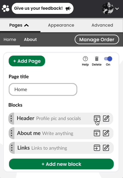
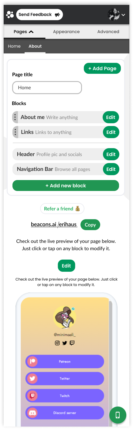
Most importantly, users need to be able to add pages and keep track of the pages they have. This allows them to organize their blocks into different sections so it is easier for visitors to navigate.
Where should users go to add and view pages?

I chose to place this feature on the Home Page because…
Users already manage content on this page
With content blocks and pages on the same page, users could later move blocks between pages
How will users add and view pages?

Alternative
Stacked Pages
Users edit the prototype directly, similar to website builders like Squarespace. They need to scroll all the way down to edit the block.

Final Decision
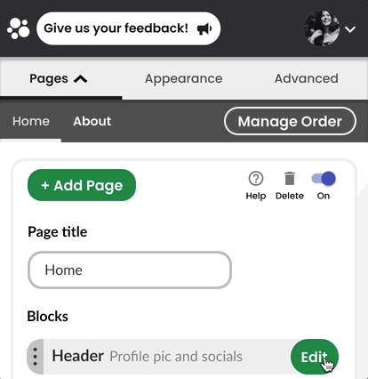
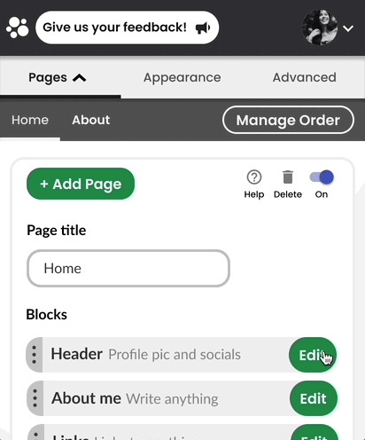
Secondary Navigation Bar
Users edit blocks instead of editing the website directly. They can still view the prototype at the bottom.
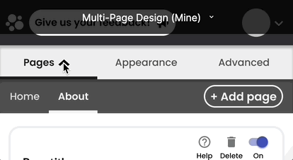
Collapsing the Navigation Bar
We received feedback that users couldn’t find what they were looking for on our website because they had to scroll to see it. I decided to make the secondary navigation bar collapsible to save vertical space on the mobile screen.
Alternative
Expandable Navigation Bar
The navigation bar is open at first so users know it’s there. They simply click the arrow to collapse it.

Final Decision
Dropdown Menu
The menu is expanded when the user first opens the page. The touchpoint for each page is large and easy to tap.
Facing technical constraints
The co-founders of my team decided to go with the expandable navigation bar instead because it would allow them to reuse code and ship the feature as fast as possible.
Final Interaction
Adding and Viewing Pages
The secondary navigation bar doesn’t appear until the user adds their first page. This hides any unnecessary functionality.

Stage 2
Moving Blocks Between Pages
Current users already have content blocks on their single-page websites. To move blocks to other pages, they need to take the time to recreate the same block. The feature to move blocks between pages solves this problem.
Option 1
Change locations in the settings menu
The option to change a block’s location is in the settings menu of the block. It doesn’t take up any extra vertical space.
Option 2
Location Field in Block Editor
The field to change the block’s location is more visible than in option 1, but takes up vertical space.
Final Decision
Move block at page level
If the user is moving a block to another page, it is likely they are restructuring their entire site and need to move multiple blocks at once. This option makes it easier to move multiple blocks at once.

Stage 3
Deciding on Navigation Bar Styles to Offer
Now that users can create and manage multiple pages, visitors to their site must be able to navigate between these pages. To address this, I worked on navigation bar styles users could choose from.

Option 1
Floating Action Button
The button doesn’t take up much space on the screen and is easy to reach with your thumb. However, if a site has many pages, the menu will cover too much of the screen when it expands.
Option 2
Bottom Navigation Bar
There will be pages that don’t match any icons. However, the bar is easy to reach with your thumb and the icons give visitors more information before they click.
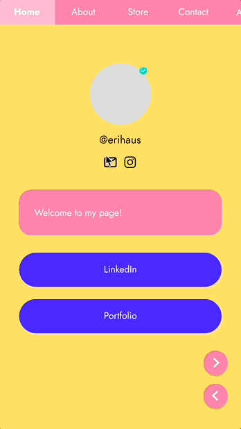
Final Decision
Tab Navigation
This design allows room for more pages. It also easily maps to a desktop version, unlike options 1 and 2.
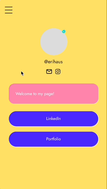
Final Decision
Hamburger Menu
Users also have the option to choose a hamburger menu for their site. This requires less color customization, is familiar to users, and translates to the desktop version.

Stage 4
Adding and Customizing Navigation Bar
We have our navigation bar styles, but it has to be simple for the user to choose a navigation bar and customize it to suit their personal brand.

Option 1
Choose Style on Appearance Page
Users can change the style and color of the navigation bar in the Appearance Tab. This is where users expect to style their site.
Final Decision
Change Style of Navigation Bar Block
As soon as users add a new page, the navigation bar block pops up on every page. This block is highly visible so they know where to go to customize it.
Final Interaction
Customizing the Navigation Bar
Conclusion
Outcomes and Learnings
Feature was shipped
Designing with a focus on growth
Considering mobile usability
Communicating with developers and product managers
What I would do differently
More research on end users’ experience with more time
Test whether design improved user retention rate and/or increased user engagement rate with Beacons profile
Rely less on what competitors’ designs look like